When Bad UX is Good For Business
Considering the user experience as part of the design process is generally seen as a good idea. Well-executed UX design can transform products and even entire businesses, elevating them to previously unseen levels of commercial success. So when can "bad UX" ever be good for business?
Given that users can effortlessly decide if their experience with a digital product was good or bad, along with the freedom to ditch services that fail to meet their expectations, bad UX design should be a thing to avoid right?
Creating Hurdles
There are situations where a business might intentionally want to slow down the user and introduce obstacles that prevent them from achieving their primary goal. One such example is when a customer wants to cancel an account or leave a subscription service. No business wants to lose customers, so how would they go about delaying the exit procedure to the point where the customer might even give up trying to leave?
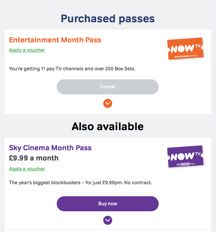
(The following UX practices were observed when cancelling an Entertainment Month Pass on NowTV.com)
Step 1: Make buttons look inactive or difficult to find

At first glance the ‘Cancel’ button, which triggers the cancellation process, appears to be disabled. Typically when a button is greyed-out this implies a certain affordance; that it is disabled or currently unavailable. The button is fully operational, but the colour in this context is clearly being used to deceive the user into thinking it doesn’t work.
Step 2: Make actions ambiguous

When designing forms and UI elements it is important to label buttons so the function is unambiguous. In the screenshot above the function of the primary button is clear and explicit: “I want to stay”. The function of the secondary button is less obvious. “I don’t want” has negative connotations and this implies that tapping on the button will end the process. Note the arrangement of the buttons as well — typically in a multi-part form the ‘continue’ button is positioned on the right and the ‘cancel’ button on the left. The opposite is true here, increasing the probability the user will tap the wrong button.
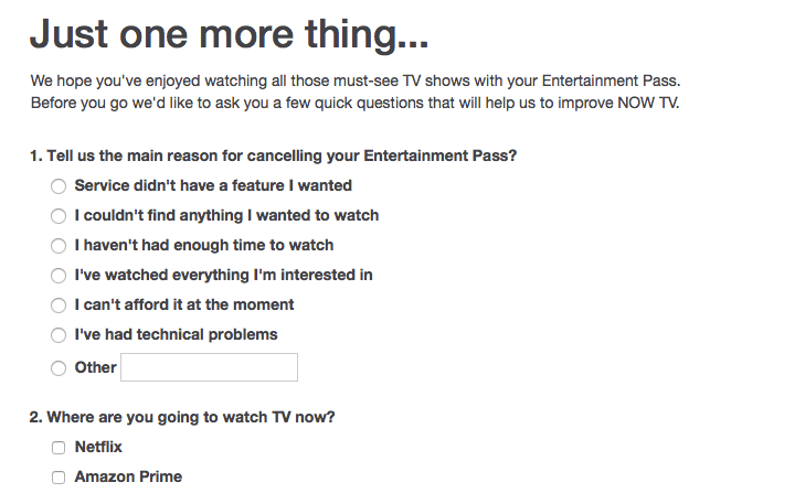
Step 3: Make users fill in a form

Everyone hates filling out forms, so why not use one here? The form has a dual purpose here: the data captured will help the business understand why the customer has left, but it also acts as another barrier for the user. When asked to justify their departure, the customer might decide that they don’t actually want to leave and stick with the service.
Step 4: Make direct comparison with competitors confusing

Finalising the cancellation process with an attractive offer to stay is a clever way to keep customers on-board. The customer may already be considering moving to a competitor’s service, so why not try to undercut them? By limiting the offer to four months it makes comparison with the competitor more difficult — especially if the other service is charged annually. The reduced price and the additional layer of doubt may be enough to derail the leaving process.
Summary
If retaining customers at any cost is your key objective then you can ignore good user experience practices and adopt some of the 'dark patterns' detailed above. Slowing a user down or introducing doubt might be enough for them to abort the leaving process altogether, but this comes at a cost.
When UX is impaired significantly during the leaving process it will tarnish future relationships with the customer. Unhappy customers are more likely to discourage their friends from using poor services and this might end up costing you more in the long-run.
The term ‘closure experience’ has been coined by Joe MacCleod to describe these break-ups between service users and service providers. He defines a good closure experience as a “satisfactory conclusion to a product or service relationship”. You can learn more about his research here.
This article was originally posted on Medium 20th July 2016